When using CssLayout in main window, content does not seem to show scrollbar horizontally

Hi,

I am using a CssLayout in the main window to provide a bit of responsiveness to my application. This works fine. However, I am seeing no horizontal scrollbars anymore. They seem to be just below the visible part of the window because scrolling is possible using the arrow keys.
Basically, I am using a CssLayout in the top of my main window to enable resposive behaviour and then have certain parts of the screen hidden through style changes if applicable.

As I’m using a rather large main window definition originally I tried to strip stuff to see if anything was conflicting but was unable to find anything other then that when changing the CssLayout tag to a vbox - everything works fine (but there is no responsive behavior). When switching back to the CssLayout the behavior is as described.

This is the main window definition:


<window xmlns="http://schemas.haulmont.com/cuba/window.xsd" 
        xmlns:ext="http://schemas.haulmont.com/cuba/window-ext.xsd"
        xmlns:main="http://schemas.haulmont.com/cuba/mainwindow.xsd" 
        caption="mainMsg://application.caption"
        class="com.axxemble.base27.web.mainwindow.ExtAppMainWindow" 
        messagesPack="com.axxemble.base27.web.mainwindow">
    
    <layout expand="mainLayout">
        <cssLayout id="mainLayout" 
                   responsive="true" 
                   stylename="responsive-container"
                   width="100%">
            
            <hbox width="100%" 
                  height="46px"
                  id="header" 
                  align="MIDDLE_CENTER"
                  expand="spacer" 
                  ext:index="0"
                  stylename="header">
                
                <button id="menuShow" 
                        height="46px"
                        icon="font-icon:BARS"
                        invoke="toggleMenu"
                        stylename="menuShow"/>
                
                <label id="spacer" align="MIDDLE_CENTER"/>
                
                <main:userIndicator align="MIDDLE_LEFT" 
                                    stylename="headerUser"/>
                
                <label width="20px"/>
                
                <main:logoutButton align="MIDDLE_RIGHT" 
                                   icon="font-icon:SIGN_OUT" 
                                   width="40px"/>
            </hbox>
            
            <hbox id="mainBox" width="100%" height="100%" expand="mainPanel">
                <vbox id="navPanel"
                      expand="toolsPanel"
                      stylename="navPanel" 
                      width="250px"
                      height="100%">
                    
                    <scrollBox id="toolsPanel" 
                               stylename="toolsMenu" 
                               width="250px">
                        
                        <button id="menuDashboard" 
                                caption="msg://Home" 
                                height="43px" 
                                icon="font-icon:HOME"
                                invoke="loadDashboard" 
                                stylename="menuLevel0Btn" width="100%"/>
                        <button id="menuAbout" 
                                caption="msg://About" 
                                height="43px" 
                                icon="font-icon:INFO_CIRCLE"
                                invoke="loadAbout" 
                                stylename="menuLevel0Btn"
                                width="100%"/>
                    </scrollBox>
                </vbox>
                
                <vbox id="mainPanel"
                      stylename="mainPanel" 
                      expand="mainWindow"
                      height="100%">
                    
                    <hbox id="mainWindow" 
                          expand="workArea" 
                          ext:index="1"
                          width="100%">
                        <main:workArea id="workArea" 
                                       height="100%">
                            <main:initialLayout spacing="true" 
                                                stylename="initialBackground"/>
                        </main:workArea>
                    </hbox>
                </vbox>
            </hbox>
        </cssLayout>
    </layout>
</window>

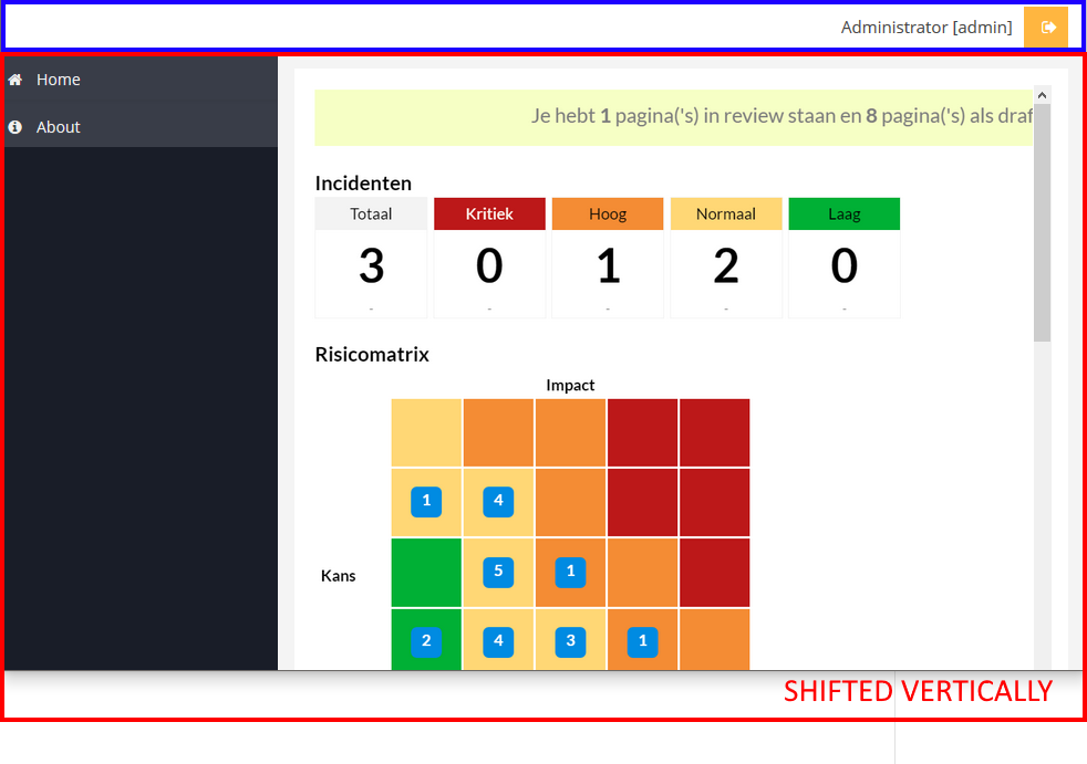
The main window initially loads an image that should show scrollbars when the window is too small or high:


@Override
public void ready() {
    super.ready();
    // Initially load dashboard window
    openWindow("base$dashboard-general", WindowManager.OpenType.THIS_TAB);
}

public class DashboardGeneral extends AbstractWindow {
    @Inject
    private Embedded imgDashboard;

    @Override
    public void init(Map<String, Object> params) {
        imgDashboard.setSource("theme://images/Dashboard.png");
    }
}

Attached i the modules directory of the stripped project without any of the build stuff.

Is this an issue, defined behaviour or am I doing something wrong? Any help appreciated.

Regards,
Berend

csstest.zip (371.2K)

Hi,

It seems that you have attached not a full project. Please use zipProject gradle task to generate proper ZIP archive with project files. You can call it using Search icon on Studio tool bar.

As for your screen, have you written CSS rules for your responsive containers ? CssLayout requires CSS styling to be responsive: CssLayout - CUBA Platform. Developer’s Manual

Hi Yuriy,

Thanks for the reply. I may have corrupted the project while cleaning up to get the project small enough - I didn’t know about the zipProject gradle task. As the project is now corrupted (at my side as well) I need to recreate it which may take some time.

Meanwhile - there are some styling rules provided, see below. And actually, the responsiveness is working fine except (!) for the main window to have the horizontal scrollbar hidden below the bottom of the screen (on other pages I see the buttons partially hidden below the bottom of the screen).


/* Responsive styling */
.responsive-container {
	/* Hide logo, menu, register button and username on smallest screens */
    &[width-range~="0-500px"] {
      .navPanel {
		display: none !important; 
      }
	  .headerUser {
		display: none !important;  
	  }
	  .headerRegisterIncident {
		display: none !important;
	  }
	  .base27Logo {
		display: none !important;
	  }
    }
	/* Hide logo, menu and register button small screens */
    &[width-range~="501-650px"] {
      .navPanel {
		display: none !important; 
      }
	  .headerRegisterIncident {
		display: none !important;
	  }
	  .base27Logo {
		display: none !important;
	  }
    }
	/* Hide logo and menu on medium screens */
    &[width-range~="651-900px"] {
      .navPanel {
        display: none !important; 
      }
	  .headerRegisterIncident {
		margin-left: 15px !important;
	  }
	  .base27Logo {
		display: none !important;
	  }
    }
	/* Hide menu button on larger screens (and give search field a bot more spacing) */
    &[width-range~="901px-"] {
	  .menuShow {
		display: none !important;
	  }
	  .searchField {
		margin-left: 15px;
	  }
    }
  }

Hi Yuriy,

Attached is a working / stripped test project. On the dashboard and on the about you can clearly see the behavior I refer to. When disabling all custom styling the behavior is still the same so I think it is an issue in the responsive support of the platform.

Or I am doing something wrong - that’s always possible :wink:

TestProject.zip (690.5K)

Please note, that CssLayout is not a drop in replacement for VBoxLayout since it requires CSS rules to layout children properly.

There is a problem in your project with vertical CssLayout which emulates vertical layout. Your mainBox is shifted by vertical axis due to CSS block rules:

You have to provide CSS rules that will layout children components vertically.

Example:


<cssLayout id="mainCss"
           stylename="demo-main"
           width="100%">
    <hbox stylename="demo-header" width="100%">
        <label value="Header" align="MIDDLE_LEFT"></label>
        <button caption="Demo" align="MIDDLE_RIGHT"></button>
    </hbox>

    <vbox height="100%" stylename="demo-container">
        <groupBox caption="Demo content" height="100%" width="100%">
        </groupBox>
    </vbox>
</cssLayout>

CSS rules for vertical layout emulation with fixed height of header:


.demo-main {
  border: 2px solid black;
  // vertical emulation with fixed height 40px top panel
  padding-top: 40px;
  font-size: 0;
}

.demo-header {
  background: light-green;
  border: 2px solid green;
  // shift top panel to the top
  margin-top: -40px;
}

.demo-container {
  background: yellow;
  border: 2px solid orange;
}

Result:

css-vertical

css-demo

Hi Yuriy,

I’ve applied the exact same solution as you described and it works. Thanks.

However, I had to adjust the main window by 24px as well (margin-top: -24px). I have absolutely no idea why but it appears necessary to avoid an empty space between the header and the main window. A space that was not explained by margins or padding from a div in the document structure/divs when looking with the element inspector.

Here is the important part of the screen XML:


      <cssLayout id="mainLayout"
                   responsive="true"
                   stylename="responsive-container"
                   width="100%">
            <hbox width="100%"
                  height="46px"
                  stylename="responsive-header"
                  expand="header">
                      <label ..../>
                      <hbox ..../>
            <hbox id="mainBox"
                  width="100%"
                  height="100%"
                  stylename="responsive-main"
                  expand="mainPanel">
                       <vbox .../>
                       <vbox .../>
              </hbox>
      </cssLayout>

And the CSS:


.responsive-container {	
	/* vertical emulation with fixed height 46px header */
	padding-top: 46px;
  }

.responsive-header {
  /* shift header to the top */
  margin-top: -46px;
}

.responsive-main {
  /* shift main up? */
  margin-top: -24px;
} 

And this reflects all changes I applied.

You have forgotten to add font-size: 0; to .responsive-container. Then you can remove margin-top: -24px;. Font size can affect sizing of div blocks inside Csslayout.

Yep - that did it. Wasn’t aware this was of any importance. Thanks!