I’m really enjoying using this platform and I’ve just set up my own IconSet as per your documentation. I have a library of SVG files that I would like to use as icons within my application and at the moment they have a native width and height of 480px. Each entry in my IconSet is of the following form:
Obviously 480px is way too big for display purposes, so at the moment I have “shrunk” the original SVGs to 24px. What I would like to do, however, is display them at varying sizes throughout my application, e.g. 24px, 32px, 48px.
Rather than create 3 or more separate enums for these sizes, I was looking for a method to dynamically size them. For example, using an icon at the moment would look like this:
icon="PP_CUSTOMER"
But to show it at a specific size it might look like this:
icon="PP_CUSTOMER:24"
I know it’s probably a big ask, but would there be any way for me to implement this?
I’m not sure if having several sizes of the same SVG icon is efficient. I guess that the reason why you need this is that some components (e.g. buttons) don’t specify image icon size explicitly, as a result, the original image size is used.
Instead of having several SVG icons, I recommend managing SVG icon size using styles.
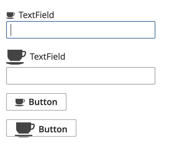
As an example, I took the Coffee icon from Vaadin Icons. The original size of this icon is 16x16.
In order to fix the default size of image icon for the button component, we can add the following styles in the theme extension:
// Default image icon size
.v-button img.v-icon {
  height: round($v-unit-size / 2); // will be 14 for the Hover theme
  width: round($v-unit-size / 2);
}
Also, let’s add specific styles to make our icon 32x32
// Buttom specific styles
.v-button.icon-32 img.v-icon {
  height: 32px;
  width: 32px;
}

// Field caption specific styles
.v-caption-icon-32 > img.v-icon {
  height: 32px;
  width: 32px;
}
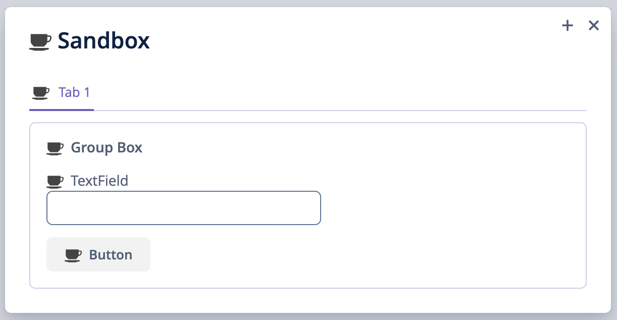
In order to test different icon sizes, we can use the following component definitions:
Thank you for the reply Gleb, you demo project works great, but I’m having problems getting it to work in my application.
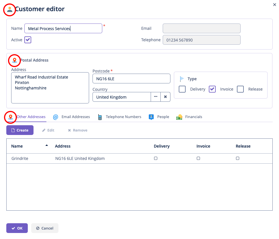
I’m not sure if I’ve got the class names right, the specific icons I’m trying to change are group box icons and tab sheet icons. Also important to change is the window icon (not sure this one is possible). By window icon I mean the icon that is shown in the main caption when you open the screen in dialog mode.
Hi Gleb, sorry for the lack of information. I have attached a screenshot of a dialog with three icons I would like to resize: the dialog window caption, a group box caption and a tab sheet caption (circled in red).
Unfortunately I have no code, I have tried various styles in the Helium theme extension and nothing seems to work. Is Helium extensible like other themes?