Toggle button for left side menu using halo theme

Hi,

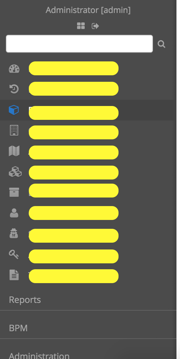
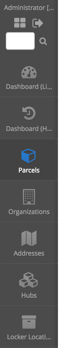
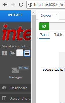
I would like to implement a toggle button which would resize the side menu to just show the icons and not labels (PFA) for more space for the main content area. Is there something already there for this. If not what should be the approach.

Since the UI is responsive, what I want is already happening on devices with smaller screens.

Also, is there some way that I can move the FTS search box from left side menu to top?

Thanks

Screen Shot 2017-09-18 at 10.34.49 AM

Screen Shot 2017-09-18 at 10.37.01 AM

Hi,
You can add a button to the main screen which will toggle style for layout, for instance:

public void toggleSideMenuSize() {
	if (getStyleName().contains("side-menu-large-icons-style")) {
		removeStyleName("side-menu-large-icons-style");
	} else {
		addStyleName("side-menu-large-icons-style");
	}
}

Style definition

.side-menu-large-icons-style {
	.c-sidemenu-panel {
		@include side-menu-large-icons-style;
	}
}

You can find to full definition of styles responsible for responsive side menu in the /halo/components/sidemenu/sidemenu.scss of the cuba-web-themes artifact.

Regards,
Gleb

Hi Gleb
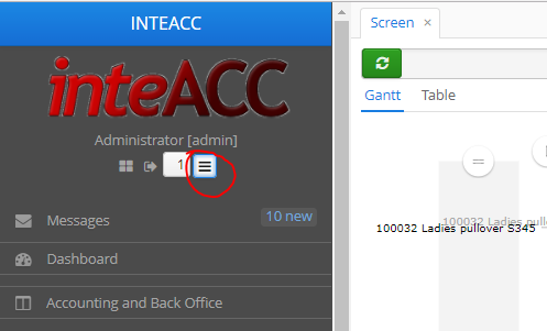
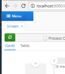
I was looking for this and it worked nicely. A quick question, how can i make the side bar disappeared and show the button to display the whole side menu in desktop which is behavior like when we display it in a smart-phone?

Could you clarify, do you need a side menu in the desktop module?

Hi Gleb @gorelov
Yes, this is all about when I am in Desktop.
I want toggling between this default view of SideMenu

image

and this while in Desktop.

image

Currently, I Toggle between the default SideMenu and the following:

image

and can we also reduce the size of the image when i am reducing the size of the sideMenu?

I don’t understand what do you mean be Desktop. In CUBA Platform terminology the desktop module is an additional client module based on Swing. And it has no Side Menu.

Nevertheless, based on your screenshots, I can suggest you using styles for the drawer button to achieve what you want.

.side-menu-drawer {
  padding-top: $cuba-sidemenu-top-height;

  .c-sidemenu-panel {
    overflow: visible;
    width: 0;
    border-right: 0;
  }

  .c-sidemenu-toggle,
  .c-sidemenu-mobile-buttons {
    display: inline-block;
  }

  .c-main-buttons {
    display: none;
  }

  .c-sidemenu-title {
    position: fixed;
    z-index: 100;
    top: 0;
    left: 0;
    right: 0;
    height: $cuba-sidemenu-top-height !important;
    padding-top: 0;
    padding-bottom: 0;
    -webkit-backface-visibility: hidden;
    backface-visibility: hidden;

    .v-label {
      line-height: $v-unit-size;
    }
  }

  .c-sidemenu-wrap {
    @include valo-menu-style;

    position: fixed;
    z-index: 9000;
    top: $cuba-sidemenu-top-height;
    bottom: 0;
    height: auto;
    max-width: 100%;
    overflow: auto;
    padding: round($v-unit-size / 2) 0;
    @include transform(translatex(-100%));

    @if $v-animations-enabled {
      @include transition(transform 300ms);
    }

    .v-edge & {
      @include transition(none);
    }
  }

  .c-sidemenu-panel.c-sidemenu-open .c-sidemenu-wrap {
    @include transform(translatex(0%));
  }
}

Add side-menu-drawer style to the root layout. Take notice that styles above applicable for responsive side menu template. If you use a different template you need to change styles according to your template.

Regards,
Gleb

Hi Gleb
You understood correctly, more specifically I mean desktop = desktop computer screen size.

Thank you for the css codes. I used it in a brand new app without any customization, the elements are not aligned, see below the screen-print.
image

If you upgrade this later, would appreciated if you share.

Hi,

As I said before, styles above applicable for responsive side menu template. If you use a different template you need to change styles according to your template.

Anyway, I’ve created a demo project on GitHub.

Regards,
Gleb

Thank you Gleb for the sample app.

@gorelov
Awesome! I have applied your approach in my application and it is working beautifully! Thank you again.

Hello Gleb Gorelov… The demo project is nice… I want some customization in the demo project. plz advice me to implement the customization…

  1. I want the side menu to be open by default (now the side menu is closed by default. And also it is closes after the side menu selection) If it is possible to configurable by property then it will be nice (i.e., whether it is open by default or not. So the user can define it…)

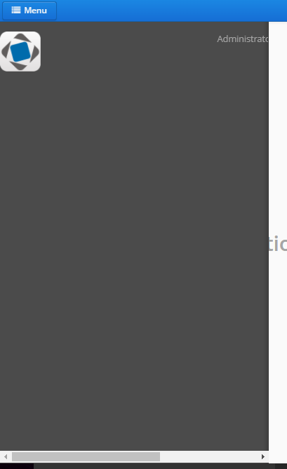
  2. I want to put image on the top bar rather than a text… I’ve attached an image and marked with red indication for better understanding… Please help me regarding this…

Thank you Gleb Gorelov…![Screenshot from 2018-03-08 16-47-42|690x379]

Hi,

  1. In the init method add the following:
sideMenu.getSidePanel().addStyleName(HaloTheme.SIDEMENU_PANEL_OPEN);

Additionally, you can create a config and check if side menu has to be opened by default.

  1. Within ext-mainwindow.xml replace <label id="appTitleLabel".../> with whatever component you like.
1 Like

A post was split to a new topic: How to close SideMenu on click outside

A post was split to a new topic: SideMenu Toggle button in Hover theme