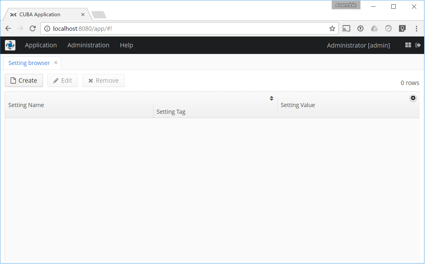
Attached are some screenshots and a test project that shows a small (but annoying) issue on tables when using Chrome.
The issue I see is:
- When hovering over the column header, the header increases height to display the sorting indicator
- The row/header column alignment differs. This effect increases when adding more columns
-
It does not happen on all columns and varies when adding or removing more columns but in general it’s rather easy to reproduce (see attached project and the first screenshot).
-
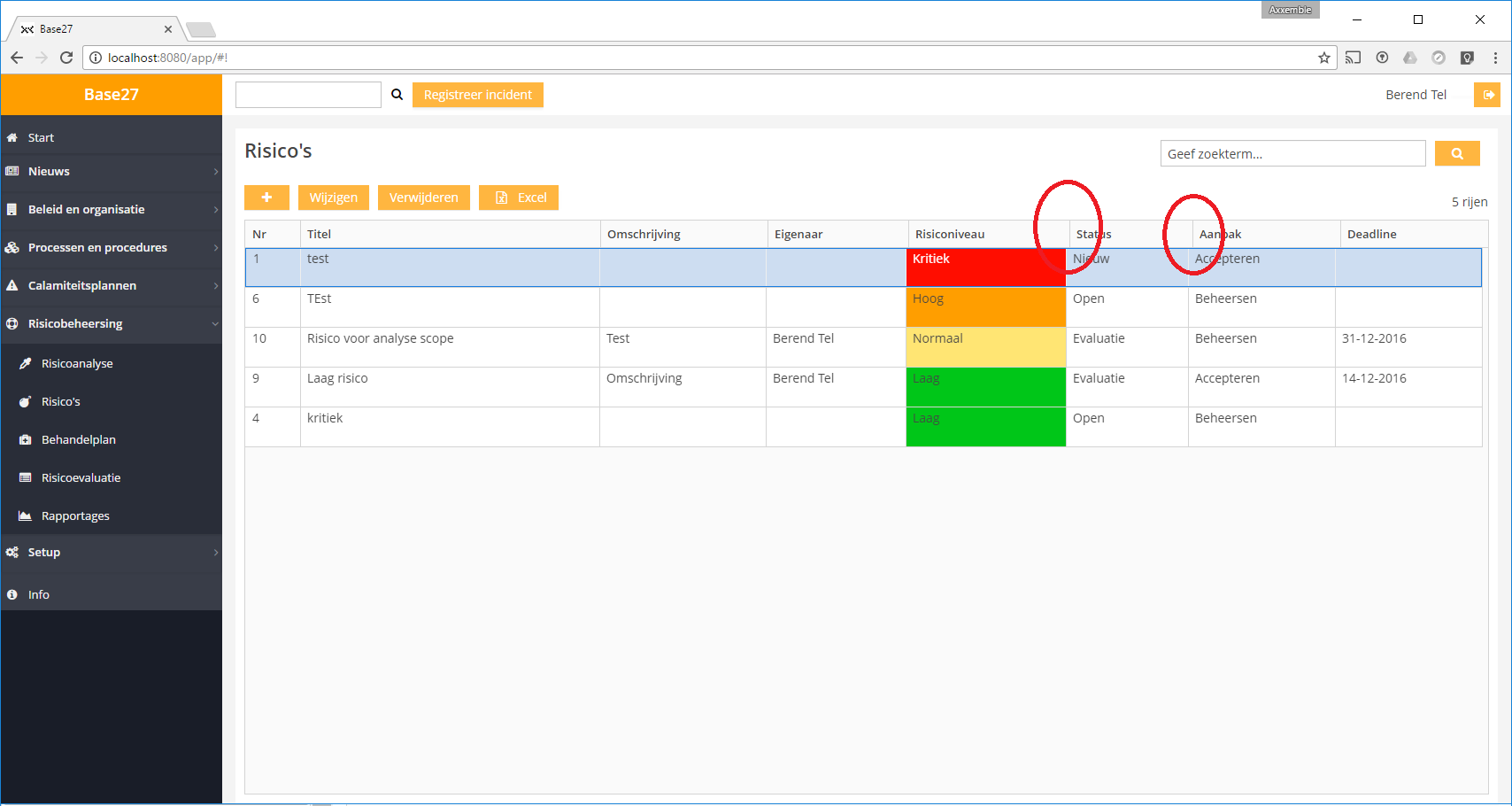
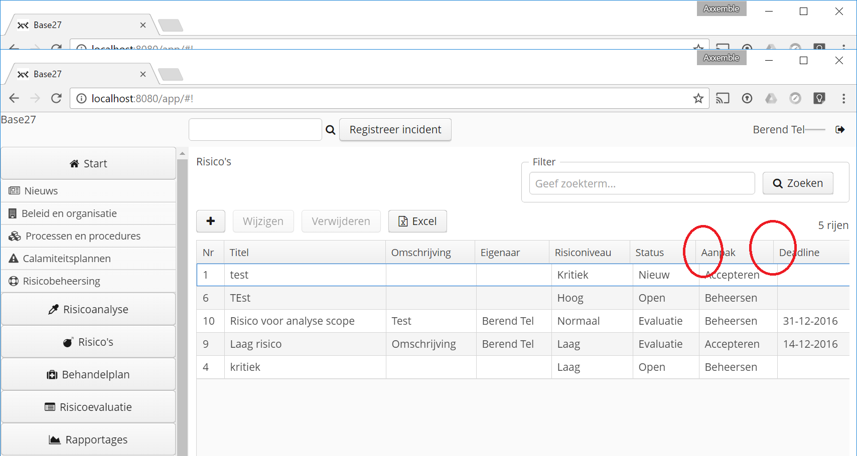
The alignment issue is not consistent but I have seen it in my project a lot more (screenshot2). At first I thought it had to do with my custom styling but when switching it all off (screenshot3) it seems persistent. In the test project the issue is not really reproducible.
I have fiddled around a bit with the text sizing (OS level) and when set to 100% it behaves differently but still wrong.
Looking into the styling that is set for the table, I could see some odd behaviour in which the header is set to a width of (e.g.) 110px and the table cell below would be set to 110.667px. The 0.667px mismatch seems to be related to border styling but I am unable to track down where this originates. And it isn’t consistent either.
In Edge the issues do not show up (or less consistently).
Chrome: 55.0.2883.87 m (64-bit)
Edge: 38.14393.0.0
Windows 10
Screen size: 1920 x 1080, text size:150% (but at 100% it shows up as well)
testtable.zip (184.0K)


