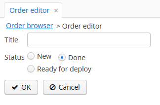
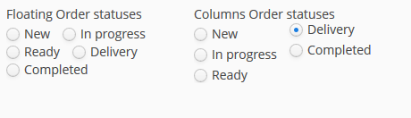
When the list of options available for an OptionsGroup reaches 5, 6 or more, laying all of them line by line is a waste of space. Alternative is to layout horizontally, which gives something similar to the screenshot below.
In our case we would like “Chèque” to be on the same column than “Traite”. This could be managed by OptionsGroup using internally a grid layout, allowing us to specify that the first 3 options should be in column 1 and the 2 others in column 2.
Even better, we could just specify “3 rows max” and then the layout would stack the options from up to down and then left to right, creating columns on the fly as necessary. That gives the same result, but avoids to specify a column for each option.
I’ve illustrated simple floating options without columns. They just wrapped to a new line if an option has width more than available space (You have to set width for the option group). In case you want to apply column-count it should be added for .my-float-options and not for each option.