Hi,
i’ve played with the new model generator a little. When using the light theme, the green colors that indicate “new” and “updated” entites / attributes (if i got it correctly) is pretty hard to read. Would it be possible to get a better color scheme for this?
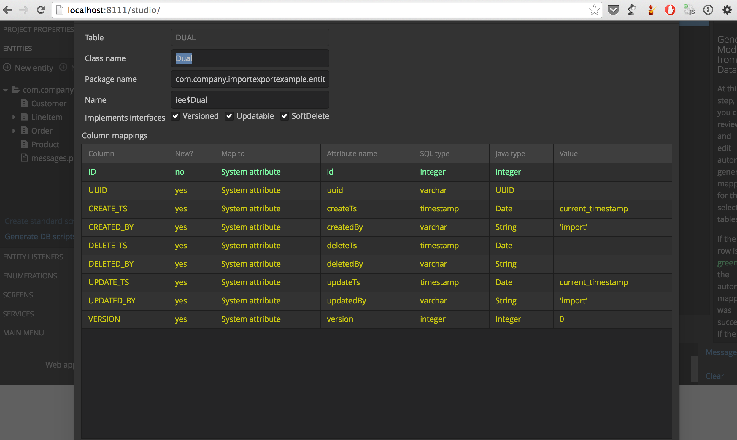
The other thing is that the “edit mapping” dialog is so huge, i can’t really interact with it on my monitor (Macbook Pro 13" - 1280x800).
These are just two hints. Not a big of a deal, just to inform you…
Bye,
Mario