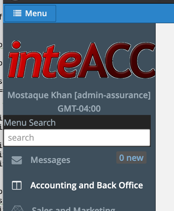
SideMenu bar is beautiful and useful for desktop computers, the width is automatically changed when the size of the screen is changed which is very good. However, in case of smaller desktop/lap screen e.g. 13", the sideBar occupies a lot of space compared to the size of the screen thus leaves only small space to show the screen contents. In this case, I want to override this size limit, thanks for shedding some lights on “how to”.
1 Like
Hello @mortozakhan
Please clarify are you talking about fixed SideMenu or responsive? And what size limit you want to change - SideMenu default width or a width starting which SideMenu slides out? Please give more details.
Regards,
Daniil.
Hi Daniel
This is about responsive side menu and the screen size that triggers appearance of the reduced width as well as when it slides out.
In addition, option to change the default width of the responsive side menu in different screen size would also be useful.
Hello @mortozakhan
I’m sorry for waiting - have missed the topic.
Unfortunately, there is no any exposed variables that can be managed. So i’ve created an issue: GitHub.
The only way to override default behavior now is to write your own custom CSS rules in theme extension.
Regards,
Daniil.
Hi
I’m glad that this enhancement has been released in platform version 7.1, thank you CUBA team for the hard work. Now I am trying to configure it to use in my project.
It is apparently working with the following exceptions:
I have used the parameters in scss file as suggested here both in hover-ext-defaults.scss and halo-ext-defaults.scss files as below:
/*Responsive side menu with custom width
=========================================*/
/* Responsive sidemenu width when it is in range between $cuba-sidemenu-togglebutton-appeared-max-width-range and $cuba-sidemenu-small-style-max-width-range*/

$cuba-responsive-sidemenu-width: 275px /*auto*/ !default;
$cuba-responsive-sidemenu-use-custom-width: true;

$cuba-responsive-sidemenu-togglebutton-caption-disappeared-max-width-range: 600px !default;
$cuba-responsive-sidemenu-togglebutton-appeared-max-width-range: 1400px !default;
$cuba-responsive-sidemenu-small-style-max-width-range: 1800px !default;


/*To enable following variables:*/
/*Responsive sidemenu width when it is opened using a toggle menu button*/
$cuba-responsive-sidemenu-small-width: 225px;  /* $v-unit-size * 3 !default; */

$cuba-responsive-sidemenu-toggled-menu-width: $cuba-responsive-sidemenu-small-width !default;
/*=======================================*/
-
It doesn’t work in halo theme, always shows the default settings.
-
It works in hover theme but the icons of new window, users menu etc. disappears in the toggle sudeMenu.
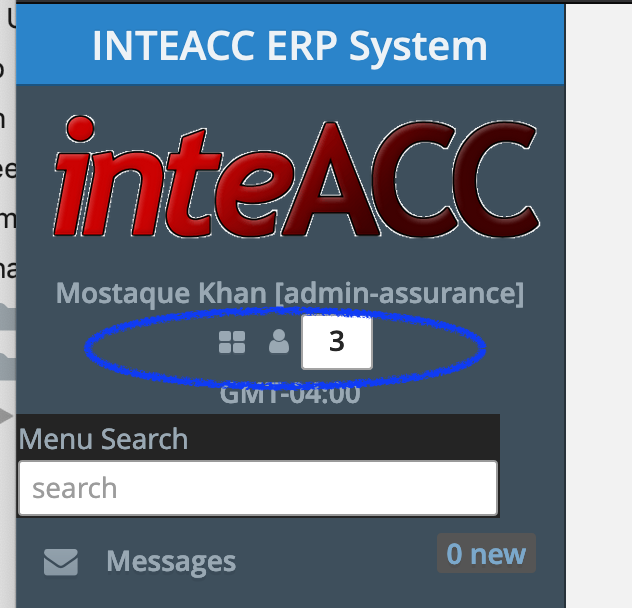
ref how it looks in larger screen with new window, user menu icons.
Thanks for any help.
Hi, @mortozakhan!
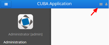
- These menu buttons are disappeared by design, see top left part of bar
If you want to show these button in the side panel you can change css styles.
- About halo theme, did you try to refresh page with removing cache (e.g. ctrl+F5)? Hover theme based on Halo and it should work.
If it does not work could you share a demo project where the problem is reproduced?