Hi all!
I’ve just published my first add-on: sw-responsive
It is a convenient wrapper for the corresponding Vaadin add-on: GitHub - JarekToro/responsive-layout: The layout to beat them all!
Using this add-on you can easily create responsive UI screens using XML markup with flexible options and no CSS required!
Let’s see how we can rewrite responsive example from documentation with the new add-on and without CSS:
<swr:responsiveLayout width="100%"
                      height="100%"
                      spacing="true"
                      scrollable="true"
                      flexible="true">
    <swr:row horizontalSpacing="true"
             horizontalSpacingSize="SMALL"
             margin="false">
        <swr:column>
            <swr:content>
                <vbox margin="true"
                      spacing="true">
                    <textField caption="Field One" width="100%"/>
                    <textField caption="Field Two" width="100%"/>
                    <button caption="Button"/>
                </vbox>
            </swr:content>

            <swr:display xs="12" sm="6" md="6" lg="6"/>
        </swr:column>
        <swr:column>
            <swr:content>
                <vbox margin="true"
                      spacing="true">
                    <textField caption="Field Three" width="100%"/>
                    <textField caption="Field Four" width="100%"/>
                    <button caption="Button"/>
                </vbox>
            </swr:content>

            <swr:display xs="12" sm="6" md="6" lg="6"/>
        </swr:column>
    </swr:row>
</swr:responsiveLayout>
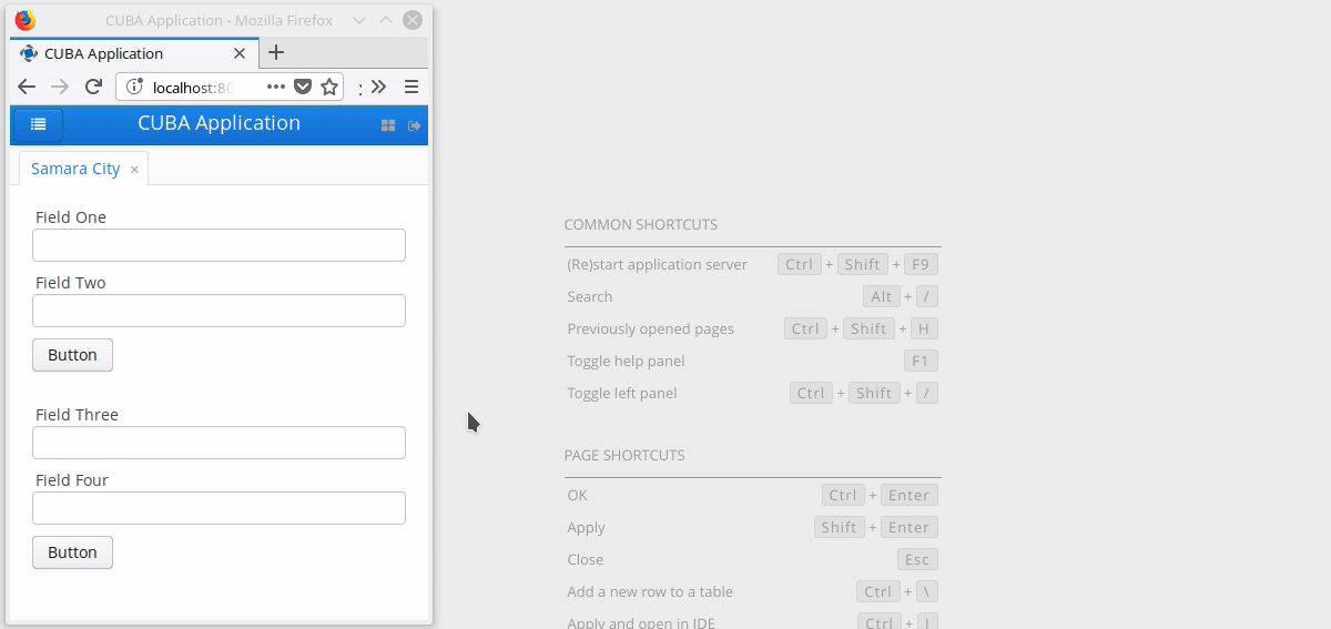
Voila!
See the demo project: GitHub - cuba-platform/sw-responsive-demo: Responsive Layout Demo
The add-on is still in development and I will be glad if you try it and share your thoughts.
All the functionality is available for platform versions 6.8 and 6.9.