Hi Gleb, thanks. It works.
So, the only way is create custom styles? There is not possibility to custom default features? There is a guide to know how to create my own stylename with other customization? For example to change foreground, font, size etc?
With hover style I know how create custom stylename. For example I defined a red textfield with the follow features:
If I try to add this code in helium-ext.scss file, it works only for the text-align feature. The others are overwritten by the standard features of the helium textfields. So, can I do the same thing with helium UI? Probably in my application I need to custom not only components colors but also other features.
Thanks in advance.
Indeed, you can implement custom styles for any component. The styles you provided work for me:
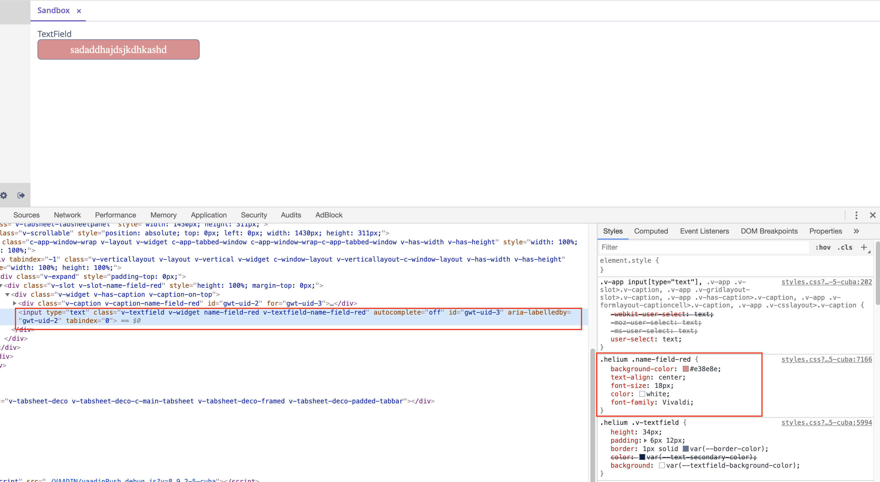
Of course, due to helium specific, some styles written for the other themes may need some changes. In order to implement correct styles, I would recommend using Browser Developer Tools to inspect specific component and see what styles it has (see the screenshot), but it’s general HTML/CSS staff.