Hi Cuba Team!
I just installed the new flat-theme and liked what I saw. Any view when this will be released? It looks very complete to me.
Regards,
Happy Cuba User!
Hi Cuba Team!
I just installed the new flat-theme and liked what I saw. Any view when this will be released? It looks very complete to me.
Regards,
Happy Cuba User!
Hi, we will release preview once platform 7.2 and 7.1.5 are released as there have been some important changes to support new theme.
P.S. flat is just a working name.
Hi,
We’ve just published a preview of the new theme (called Helium).
You can try it as add-on. Use the following coordinates:
for projects based on CUBA 7.1.5+:
com.haulmont.addon.helium:helium-global:0.1.0.BETA.1
for projects based on CUBA 7.2.*:
com.haulmont.addon.helium:helium-global:0.2.0.BETA.1
Please note that it’s a BETA version.
Looking forward to your feedback.
Awesome!
Please consider enabling support for prefers-color-scheme so the app will change from light / black automatically following the system preferences.
See: css - How to detect if the OS is in dark mode in browsers? - Stack Overflow
Once you’ve got the add-on, how do you switch to the Helium theme? I’m just seeing this:
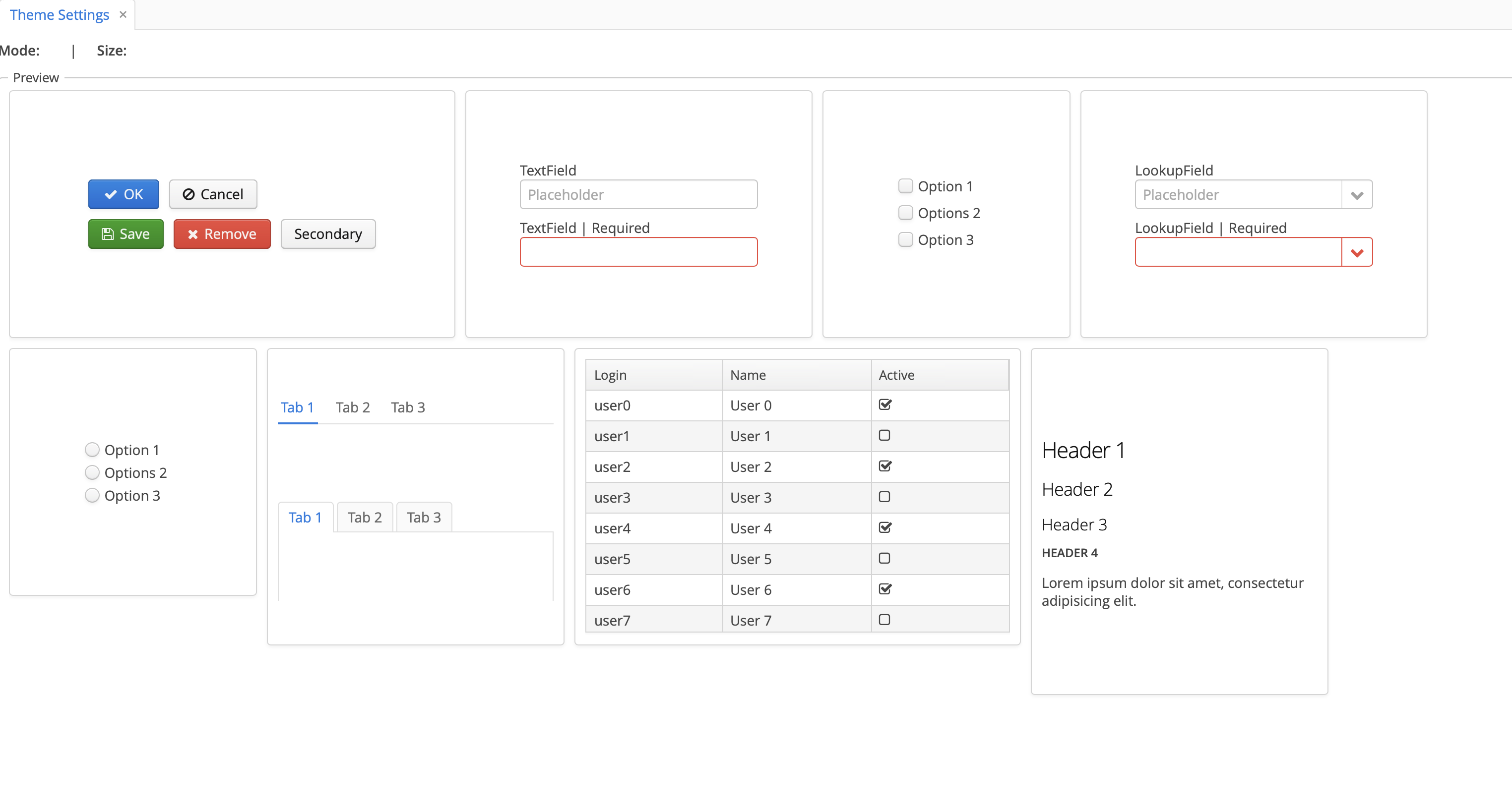
Hi,
Select Helium in settings: Help > Settings > Visual Theme
Hi
I have added the dependency in gradle file but do not see Helium theme in the Visual Theme screen.
appComponent('com.haulmont.addon.helium:helium-global:0.2.0.BETA.1')
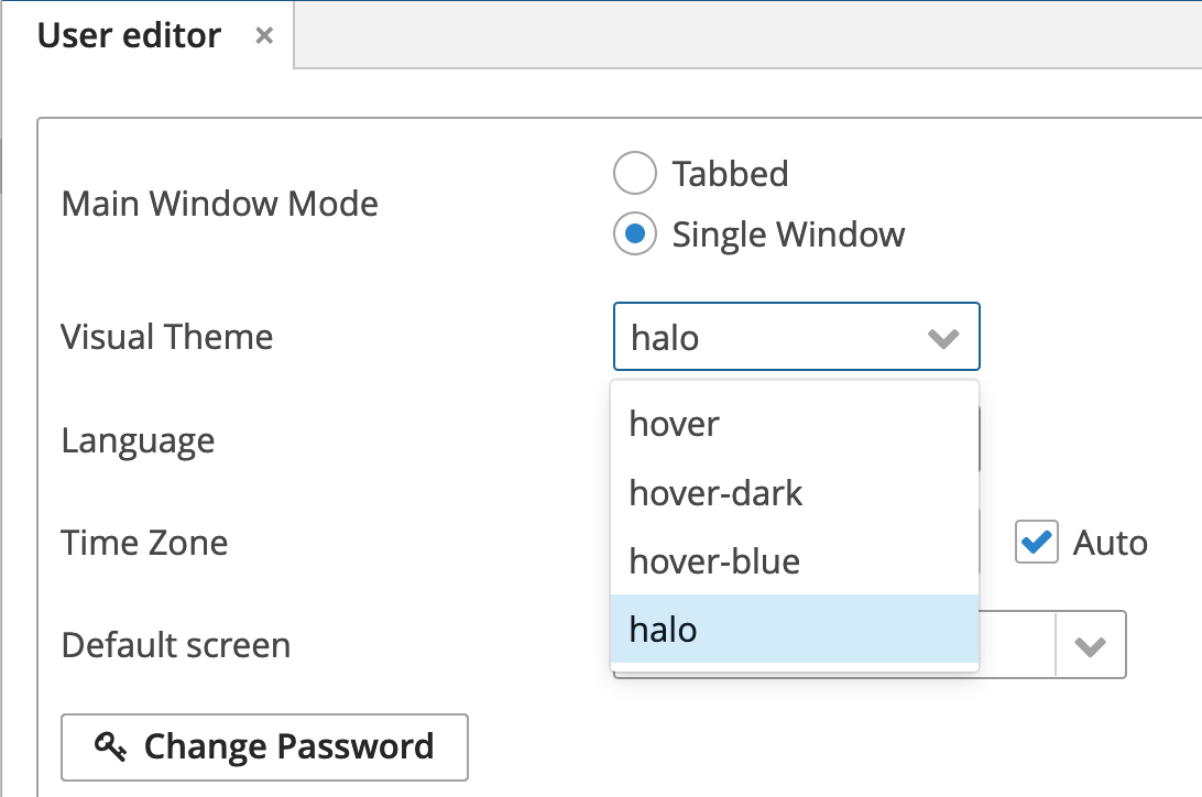
You should also update appComponents parameter in WEB-INF/web.xml of core and web app:
    <context-param>
        <param-name>appComponents</param-name>
        <param-value>... com.haulmont.addon.helium</param-value>
    </context-param>
Or better use Studio to manage add-ons.
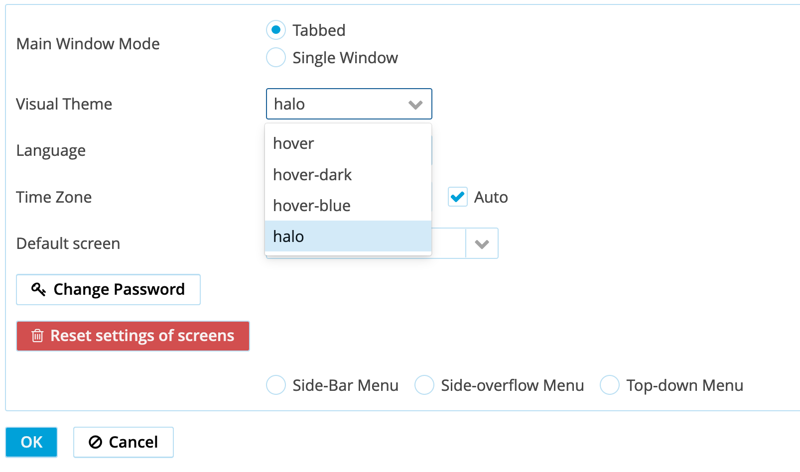
Thanks, I did that and now I see a new menu, “Theme setting” but in theme selection under Settings i still don’t find the option to select the new theme.
Hi @mortozakhan,
Maybe you need to update the property cuba.themeConfig in web-app.properties file. Take a look at the 6th step for reference.
Thanks. What will be the right file path, com/haulmont/addon/helium/helium-theme.properties?
Hi,
the path is: /com/haulmont/addon/helium/web/helium-theme.properties
Actually, you should add it manually only if you have custom cuba.themeConfig, otherwise it will be added automatically.
Thank you Vlad, It works now. and thanks for the issue log.
I have following comments/suggestions:

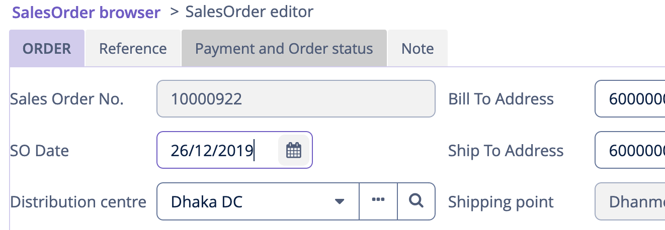
It will be a very good option addition if you may consider option to use different colour in addition to what you have designed. e.g If one user like green, may select it so that s/he will have option to use light/dark/invserse etc. of that colour. What do you think?
The logo displayed in halo theme is broken in this theme. How can this be managed?
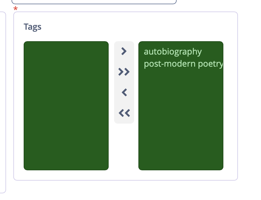
This is a great improvement over the standard styling, but if I can make one small criticism, I think the background colour for the list is a bit harsh.
Hi,
You’re right, for some components that were not completely styled, you can see a bit harsh colors, because for development purposes, i.e. to easily find not styled component, we changed background colors to some noticeable values:
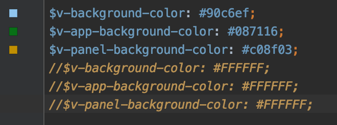
By the time of stable release, there will be no harsh colors.
You can fix that in your app by extending the helium theme and providing appropriate values for the mentioned SCSS constants, but unfortunately, Studio can’t extend a custom theme right now. Nevertheless, you can extend some built-in CUBA theme, e.g. halo and rename halo to helium including file names, mixin names, etc. if you need I can prepare an empty project with extended helium theme as an example.
Regards,
Gleb
Hi,
By design, a table in the helium theme looks like if the no-vertical-lines predefined style is applied, i.e. we removed only borders and didn’t touch spacing (you can take a look at predefined styles here).
If you need to reduce spacing, I would recommend extending the theme and add custom styles for a table.
.v-table-cell-wrapper.widget-container {
    padding: 0;
}
Actually, we tried and it doesn’t look nice, but it can be changed in the theme extension. There is a special css variable for that purpose: --tabsheet-framed-tabs-border-radius that must be defined in the helium-ext.scss (not helium-ext-defaults.scss) file.
The final release will contain several color presets. For now, only light is “official”, the others are used for test purposes only.
Extend the helium theme and add your logo image the same as for the halo theme.
Regards,
Gleb
vTower.7z (1.6 MB) Hi @gorelov,
I tried to create the same steps as mentioned above and also to extend helim theme by extending hover them then change all the hover to helim ,
But unfortunately , i’m getting very bad layout , really i don’t realize what i missed ,
attached is my sample project , please if you can help regarding
Thanks