Hi,
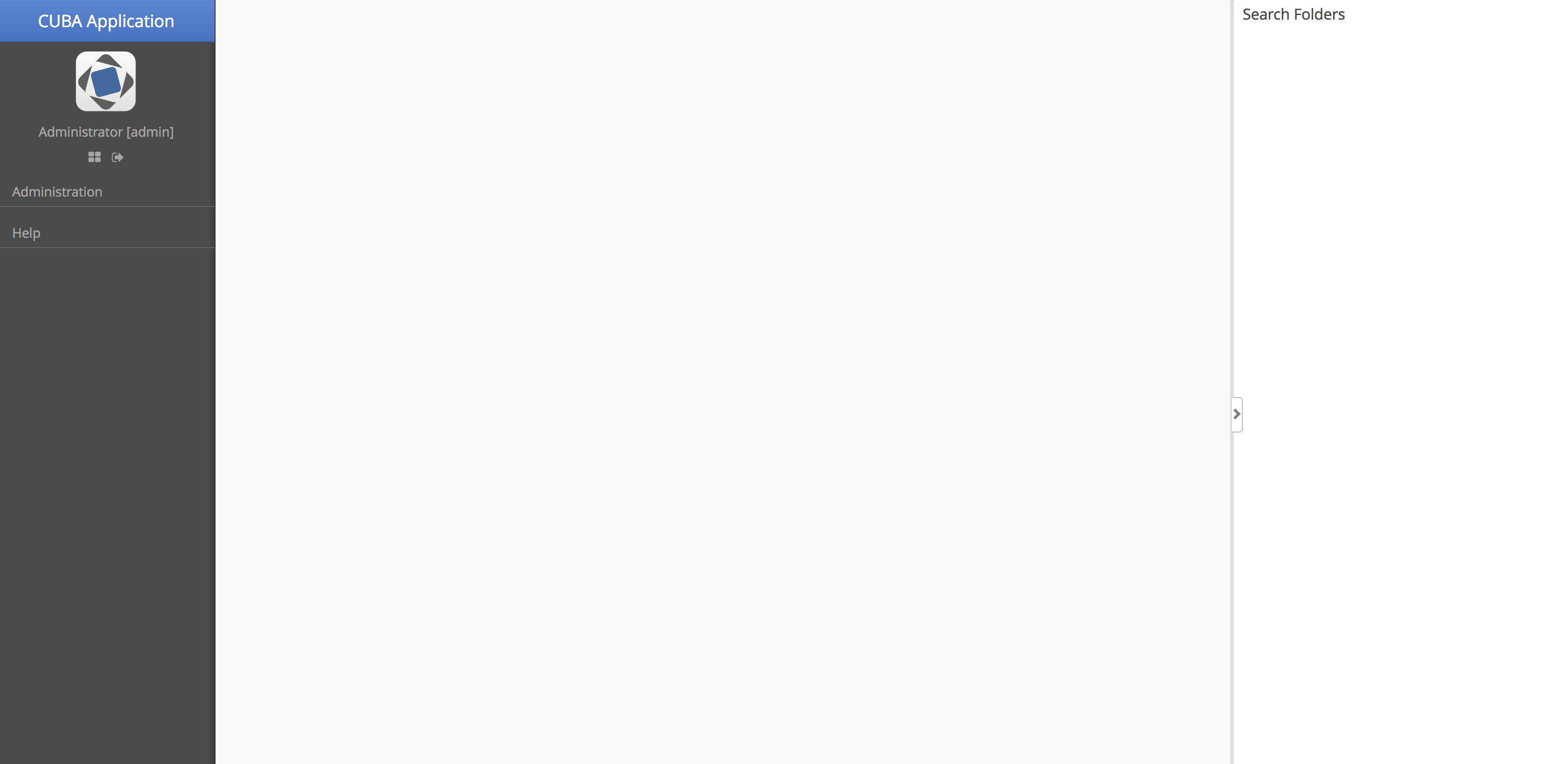
As there was a question about the MainWindow and styling recently especially with respect to the Search Folders I thought I’d add this modification i’m using which seems to work well.

MainScreenLayout.zip (79.4 KB)
Hi,
As there was a question about the MainWindow and styling recently especially with respect to the Search Folders I thought I’d add this modification i’m using which seems to work well.

MainScreenLayout.zip (79.4 KB)
Hi @JohnM
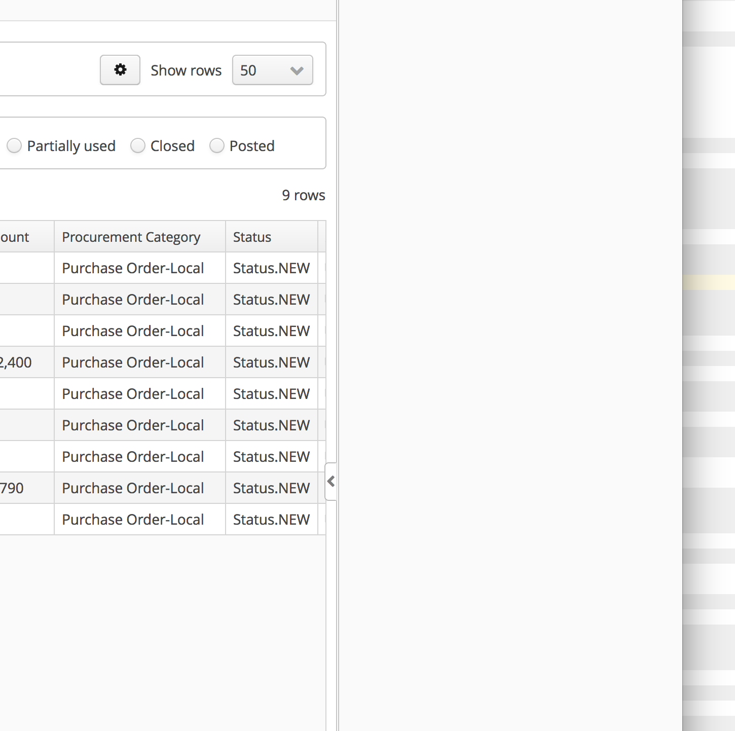
I tried your approach. One problem i am facing is, it can be docked or undocked when there is no screen loaded. I can’t dock it in case I have a screen loaded, see below.

Hi @mortozakhan
I think that has to do with the size of the split panel. If you make it slightly bigger by dragging it does the dock button swtich sides?
If it does adjust the initial size setting or if you also like remove the docking altogether.
Hi @JohnM
I have changed the parameters for both maxSplitPosition and pos to save value e.g. 25 and it worked better. However, dock and undock doesn’t work if I open the screen while the split is undocked by default.
How can keep the split docked by default? this may help dock-undock.
Hi @JohnM
Same issue here, would be nice to have it docked by default.
I tried activating the settings thinking that I will dock it then it will be saved in the settings. It stays docked but then cannot be undocked again. Not sure why.
Regards
Michael
I think this is a bug in CUBA and from memory I have already raised it.
Again from memory here I think CUBA seems to save the user settings so that the width is 0 then when you open the screen it all looks fine until you try to open the docked panel and it can’t because the width is 0.
Try leaving off the save setting option.
Makes sense, it works without settings which is great
Hi @mario
Waiting eagerly for hover theme, we are currently still not completely happy with our main window layout.
Woud you care to share XML/props you use in your order management app sample ?
In your app, mainwindow has most of what we are looking for: responsive menu on the left, fancy top bar with fancy icons.
Best Regards
Michael
Hi,
It can be found in the github repo:
Im not sure what you are exactly talking about, because i use the standard stuff from CUBA there…?
Bye
Mario
I did clone the repo and launched the app, indeed, it is standard cuba presentation.

But the app on your blog images has not the standard cuba look, and I’m pretty fond of it

Now i understand ![]()
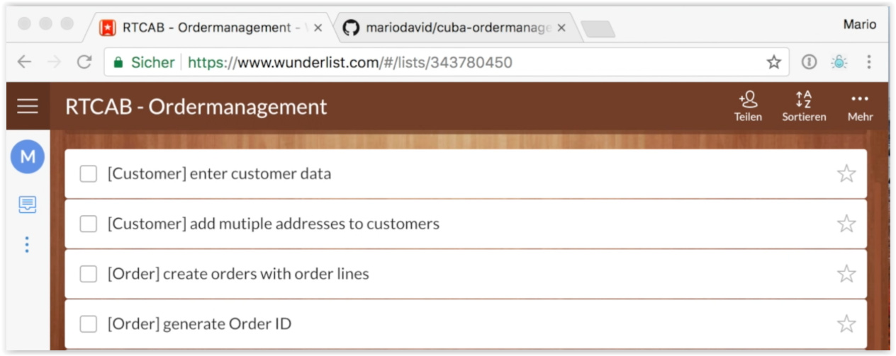
The latter image from the blog post is a task list app where i list all the things that will be done in the development of the example app:
You can find it here: https://www.wunderlist.com/ and it has nothing to do with CUBA whatsoever…
But you are right, the UI is great ![]()
Probably it is possible to get something going like this with vaadin + css though, I never tried.
Bye
Mario

Actually Cuba responsive side menu is not that far for the left part, but it does not look good on all size.
However the upper right part of wunderlist is interesting, the “mehr” menu particularly could be a natural spot for switching on/off searching folders on the right in cuba.
Let’s wait for Hover theme then 
@michael.renaud Have you tried the latest version with the save settings turned on again for the Folder Search as apparently that has been fixed now but I’ve not had a chance to test it.
for now we have taken a diff way but if we happen to cross that road again i’ll rise it here