Hello Cuba Team,
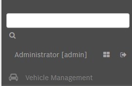
I found another detail in the FTS is not a big deal but is quite annoying. Since i think the last update the magnifying glass icon in FTS when the sidebar is vertical is totally misaligned (see attach photo) and goes in to the next line really user unfriendly.
I tried with a new project from the scratch and i have the same issue, activate FTS put the sidebar menu and wrong,
Before was okey so i think something in the last updates broke it.
If you have any workaround i can try, i tried playing with the width but is like the component is assigning wrong the 100% to the input text for the FTS (not the div containing the input and the icon) letting the magnifying glass icon without space.
Bye
Nico