Is it possible to add different type of icons in the table. I think of check mark, question mark and so on in the columns. Not just the first “icon” column.
Hi,
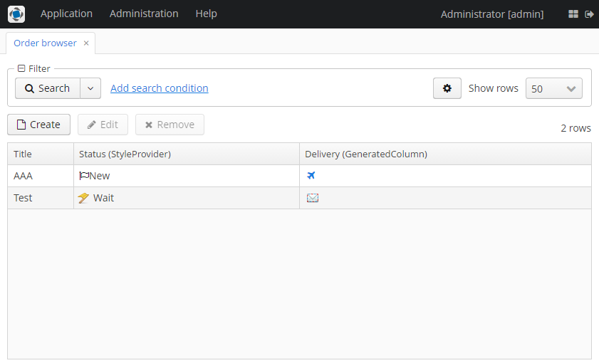
Yes, it is possible using GeneratedColumn or StyleProvider of Table.
You can add a StyleProvider and use styles to show icons to the left of a cell content:
ordersTable.addStyleProvider((order, property) -> {
    if ("status".equals(property)) {
        if (order.getStatus() == null) {
            return null;
        }
        switch (order.getStatus()) {
            case NEW:
                return "order-new-icon";
            case DONE:
                return "order-done-icon";
            case WAIT:
                return "order-wait-icon";
        }
    }
    return null;
});
CSS Styles:
@mixin halo-ext {
  @include halo;

  // font-icon example
  .v-table-cell-content.order-new-icon .v-table-cell-wrapper {
    &:before {
      color: black;
      font-size: $v-font-size;
      font-family: FontAwesome;
      content: "\f11d"; // code obtained from FontAwesome icon set
    }
  }

  // png icon examples
  .v-table-cell-content.order-wait-icon {
    background: url(icons/flag-yellow.png);
    background-repeat: no-repeat;
    background-position-y: center;
    background-position-x: 5px;
    text-indent: 20px;
  }

  .v-table-cell-content.order-done-icon {
    background: url(icons/flag-green.png);
    background-repeat: no-repeat;
    background-position-y: center;
    background-position-x: 5px;
    text-indent: 20px;
  }
}
You can read more about theme extension here: Extending an Existing Theme - CUBA Platform. Developer’s Manual
The second approach is to use a GeneratedColumn with LinkButton component:
ordersTable.addGeneratedColumn("deliveryType", order -> {
    if (order.getDeliveryType() == null) {
        return null;
    }
    LinkButton linkButton = componentsFactory.createComponent(LinkButton.class);
    linkButton.setDescription(messages.getMessage(order.getDeliveryType()));
    linkButton.setFocusable(false);

    switch (order.getDeliveryType()) {
        case AIR_MAIL:
            linkButton.setIcon("font-icon:PLANE");
            break;
        case MAIL:
            linkButton.setIcon("font-icon:ENVELOPE_O");
            break;
        case FAST:
            linkButton.setIcon("icons/fast-delivery.png");
            break;
    }
    return linkButton;
});
In both cases, you can use PNG images from your theme or font icons from FontAwesome set.
I’ve attached whole sample project so you can try it in action.
column-icons.zip (35.8K)
Hi
Is it possible to display those two column icons in one column?
Hi,
Yes, it is possible to display two icons or even three icons and other components in one column. Just wrap two LinkButton components with HBoxLayout:
ordersTable.addGeneratedColumn("deliveryType", order -> {
    if (order.getDeliveryType() == null) {
        return null;
    }

    LinkButton linkButton1 = componentsFactory.createComponent(LinkButton.class);
    linkButton1.setFocusable(false);
    linkButton1.setIcon("font-icon:PLANE");

    LinkButton linkButton2 = componentsFactory.createComponent(LinkButton.class);
    linkButton2.setIcon("font-icon:ENVELOPE_O");
    linkButton2.setFocusable(false);

    HBoxLayout hBoxLayout = componentsFactory.createComponent(HBoxLayout.class);
    hBoxLayout.add(linkButton1);
    hBoxLayout.add(linkButton2);

    return hBoxLayout;
});
Hi Yuriy,
since i have a very similar question i downloaded your example app. It works great. But using the LinkButton has the downside that when hovering and clicking the icon it will act like a link (brighter colors etc. - depending on the styles of valo). Using the CSS idea feels a little bit too noisy (just a personal taste). Would it also be possible to get a CUBA component: “icon” which does only that - displaying an icon?
Another solution would be the IconProvider (when the icon should act for a whole row not only for a particualr cell). I could also use that. The only problem that i see for this is, that it is not possible to define that the icon should not be displayed as the first column. This would be another option if it is possible to show it as the last column e.g.
Bye
Mario
In the current 6.4 version you can use a simple Label in the same way. And if you don’t assign value to it then Label will look like a simple icon.
But in case of a Table you have to wrap it in a simple layout, e.g. CssLayout since in Vaadin captions and icons of components are rendered by layouts (Table does not render captions and icons of cell components):
clientsTable.addGeneratedColumn("title", entity -> {
    CssLayout wrapper = componentsFactory.createComponent(CssLayout.class);

    Label label = componentsFactory.createComponent(Label.class);
    label.setValue(entity.getTitle());
    label.setIcon("font-icon:BEER");

    wrapper.add(label);

    return wrapper;
});
Your idea about icon component is really useful and we will think about it in this feature: https://youtrack.cuba-platform.com/issue/PL-1164
Please provide the ability to use Icons from the database!!! This eliminates the need to change the style sheet. This is WAY more work than it needs to be for a simple customer requirement.
Hi, it is already supported by Embedded component. You can see demo project here: GitHub - cuba-platform/cuba-vision-clinic: CUBA implementation of the MS LightSwitch Vision Clinic Sample
There we store image of product as byte] array in DB. We show images for Products from DB in [product-browse.xml . See image generation for table cell here
Thanks Yuriy, I was aware of the sample.
My projects use a lot of lookup tables with small images in the database. If had to use either of the techniques outlined in this post or the sample, I would have days of coding effort to do what I consider basic functionality. I recognize that I could write my own component but IMO, this should be a feature of the framework is all I am saying.
You are right and we are going to implement this component PL-1164. Unfortunately, it is not yet included to the current iteration.
Awesome and thanks!
Hi.
Image component is implemented in the platform version 6.0.0.